
01Problem
Learning, events, and community lived apart
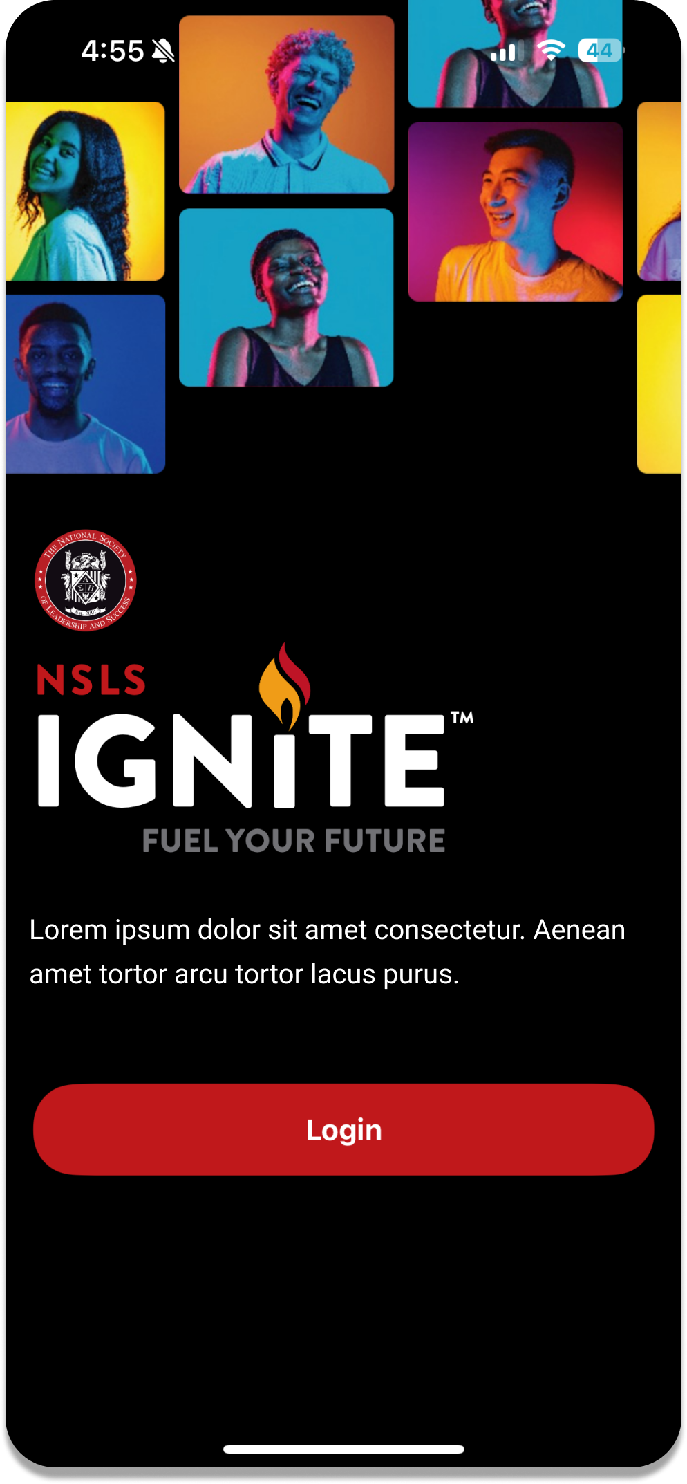
Courses, events, and conversations were isolated destinations built around desktop navigation, while students were arriving on their phones.
Selected work Case study 02
Making learning and community easier to carry with you
Leadership · Learning & community
The mobile experience
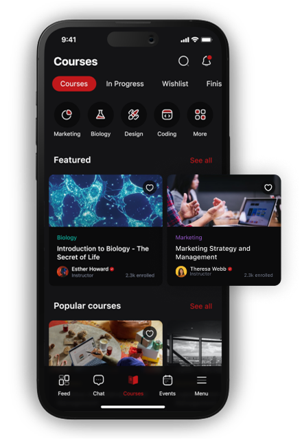
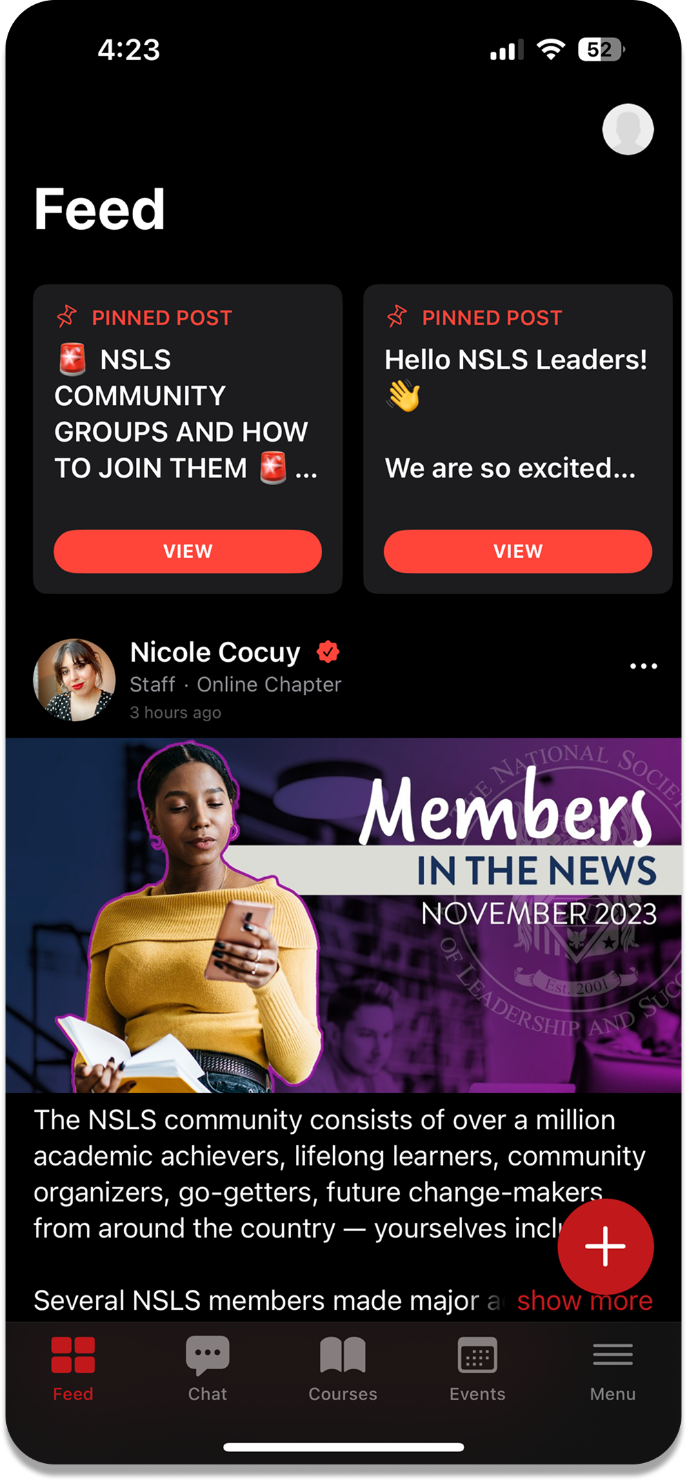
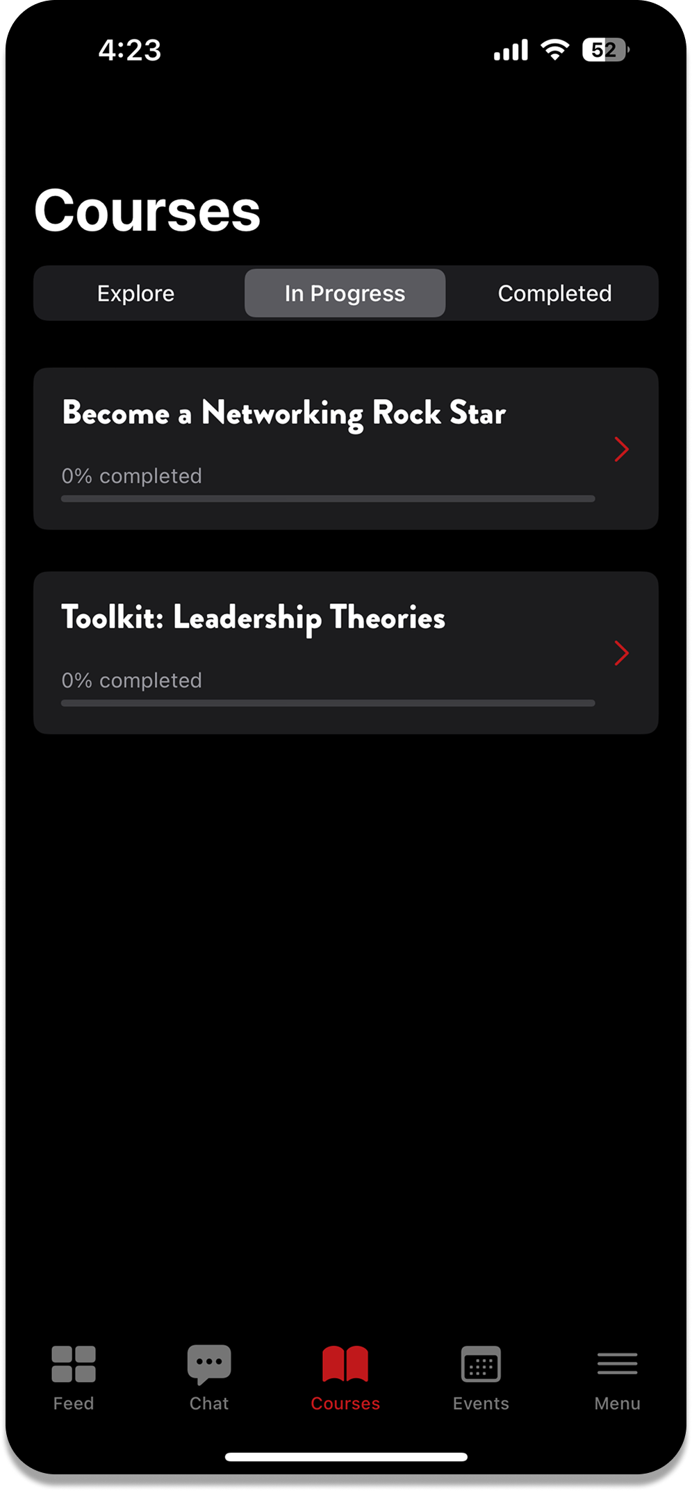
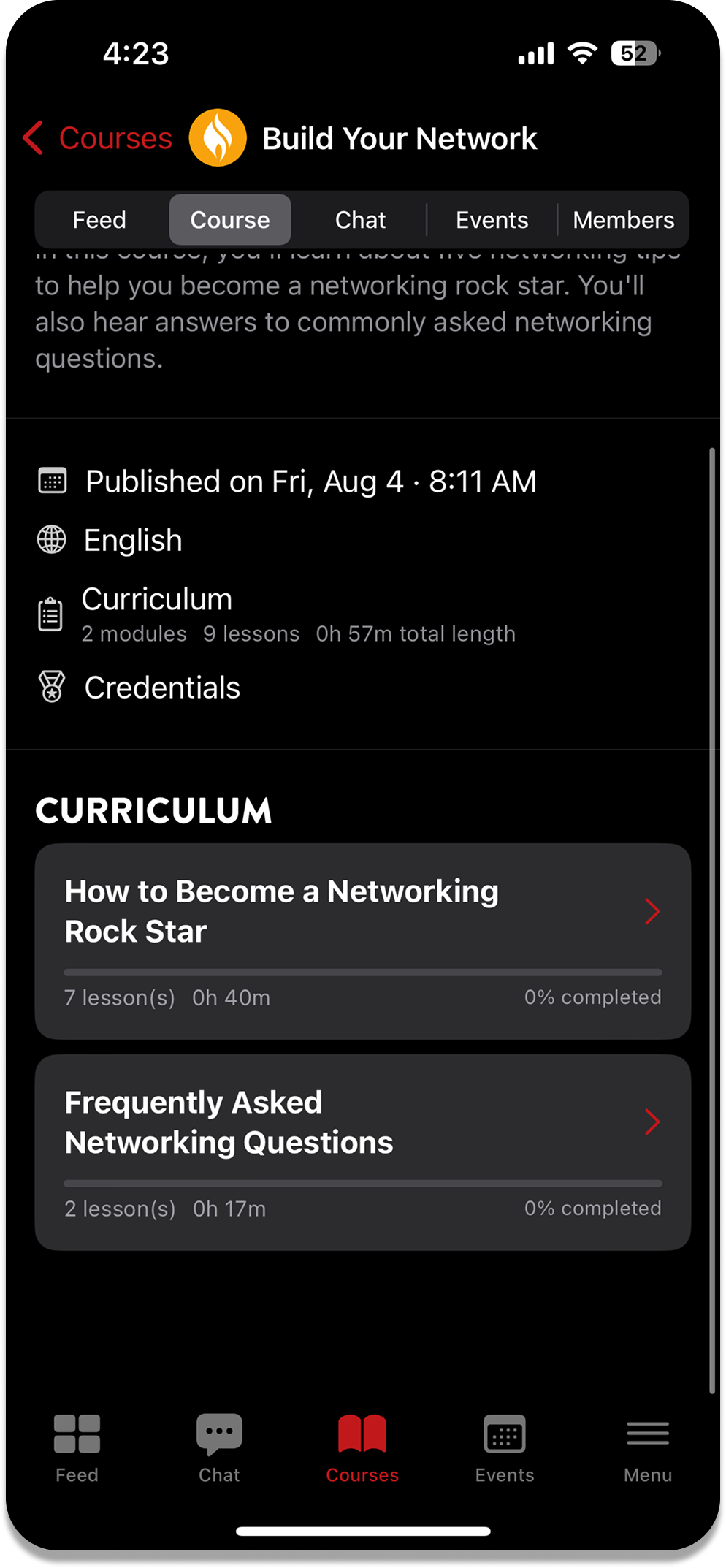
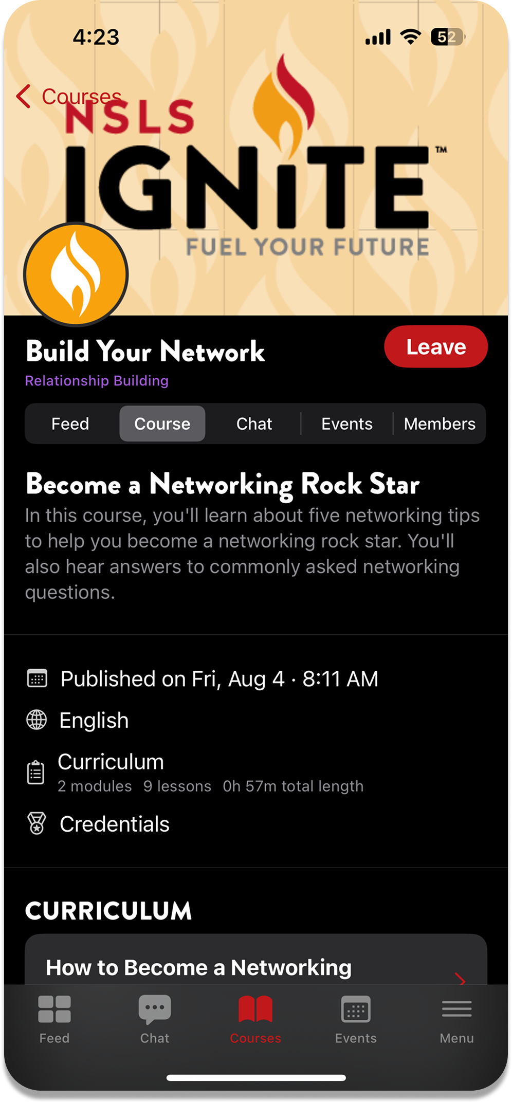
Course discovery and progress in one mobile view, with community and events a tap away.
The problem
01Problem
Courses, events, and conversations were isolated destinations built around desktop navigation, while students were arriving on their phones.
02Why it mattered
Nothing pointed a student toward what came next, so completing a course or an event did not lead back into chapter life. Active, inactive, and new members all landed without orientation.
03Solution
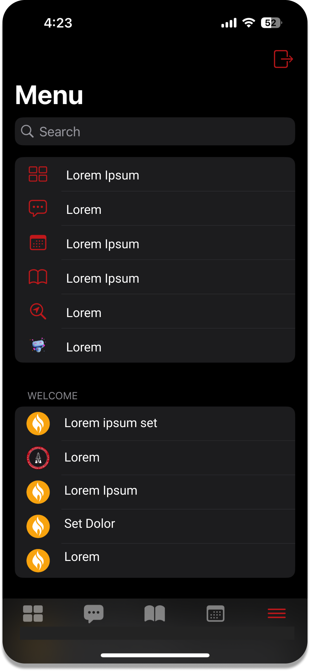
A single navigation model that connects learning, events, and community, placing the next meaningful action beside the task a student already came to finish.
Case overview
The National Society of Leadership and Success had learning content, events, and discussion spaces, but those experiences felt fragmented and were difficult to use on mobile. I helped redesign them as one mobile-first product where students could understand what to do next and stay involved with their chapter.
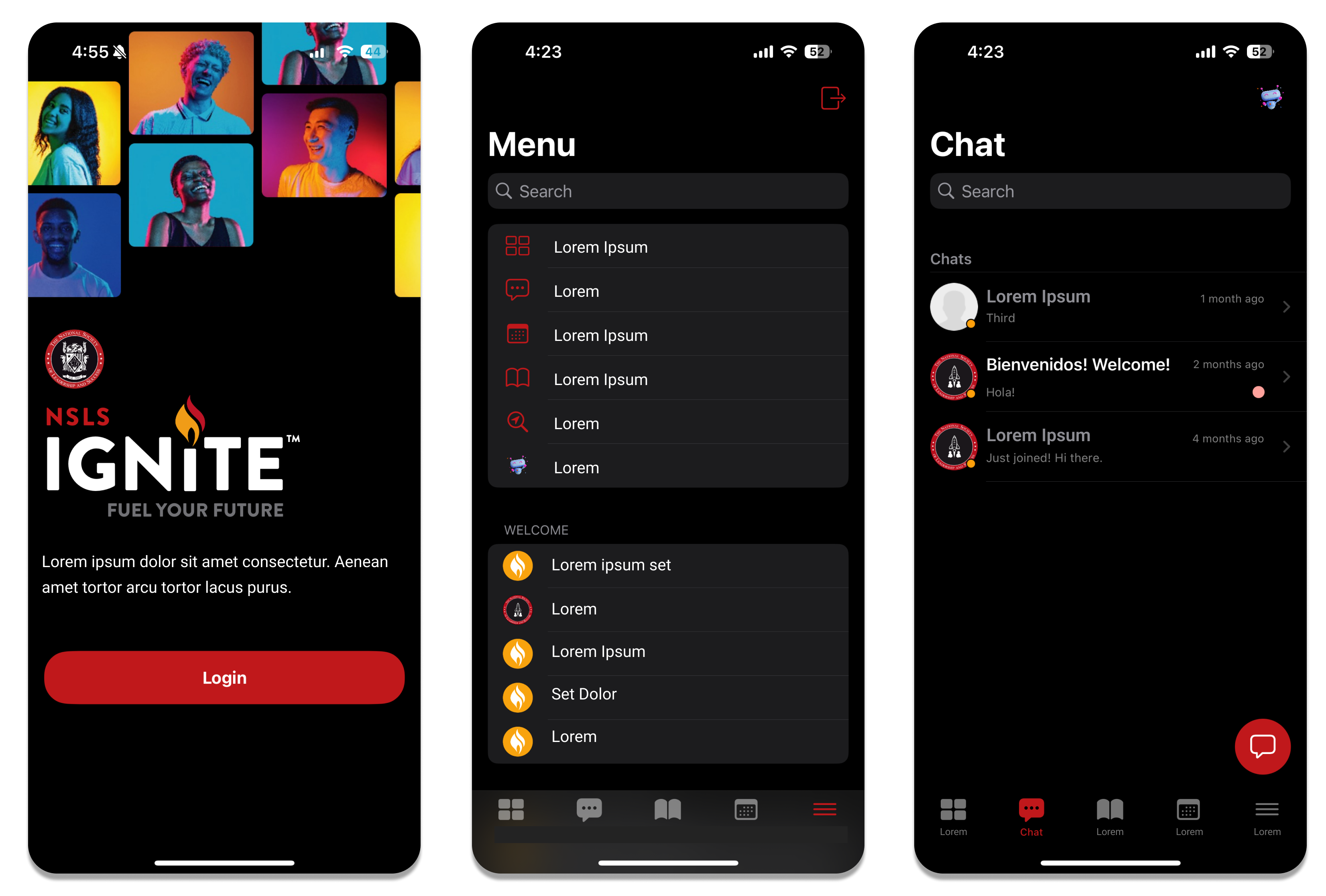
One navigation model connects learning, events, and community.
Course access and progress move into the mobile flow.
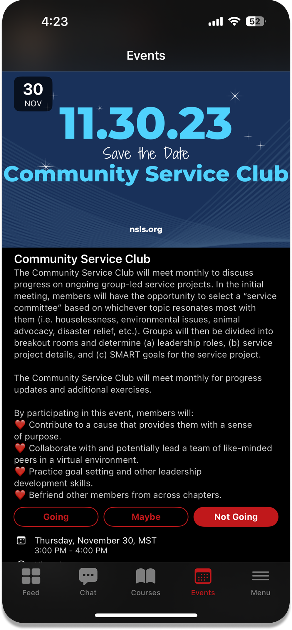
Community actions sit next to the work students already came to complete.
Customer signal
Student interviews, product analytics, support themes, and feedback from a volunteer student group pointed to the same issue. Each part of the platform asked students to reorient themselves, especially on a phone.
01
Students were trying to use the platform on phones, but the experience was still organized around desktop navigation and long, disconnected tasks.
02
Courses, events, and conversations lived as isolated destinations. Students did not have a clear reason to move between them or return after completing a task.
03
Active, inactive, and new members arrived with different levels of context. The experience needed to orient each group without adding more navigation.
Product direction
Rather than reproduce the desktop site in a smaller frame, we reorganized the product around what a student needed to continue: resume a course, find an event, respond to a conversation, or see what changed in their chapter.
Learning, events, and community shared a predictable structure and vocabulary.
Students could see where they were, what remained, and how to continue without rebuilding context.
Relevant discussions and chapter activity became part of the experience instead of a destination hidden in a forum.
One student journey
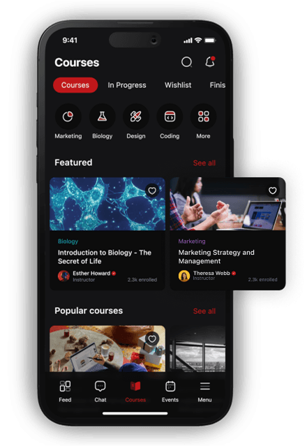
Discover a course, pick up where you left off, and see what comes next.
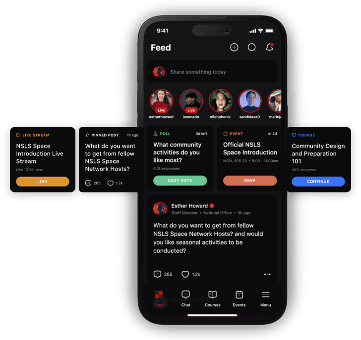
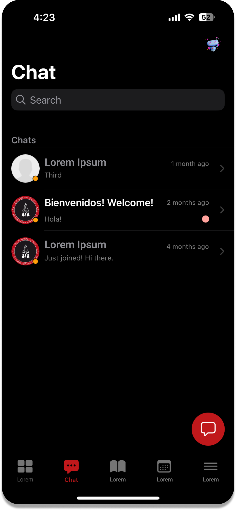
Chapter conversations, events, and learning share the same everyday experience.
A shared navigation model keeps both experiences connected.
Validation and delivery
We reviewed prototypes with student volunteers, watched for places where navigation or language still required explanation, and worked with engineering to sequence the core journeys within the semester timeline. The goal was a coherent release, not the largest possible feature list.
Student interviews and volunteer feedback shaped the information architecture and launch priorities.
A semester deadline forced clear sequencing. We focused on a useful end-to-end path through learning, events, and community instead of shipping isolated pieces.
Ideas that looked engaging in isolation did not always create a reason to return. We used that signal to connect community actions to learning and events.
We tracked adoption, participation, and course completion separately so a gain in one area could not hide a weakness in another.
Outcome
Internal product analytics from the first three months after launch showed gains across mobile use, community participation, and learning completion. Each metric is presented in its original unit.
75%
During the first three months after launch, 75% of new users accessed the platform through the mobile experience.
+41%
Internal product analytics showed a 41% increase in forum activity during the same three-month post-launch window.
27% to 62%
Course completion rose from 27% to 62% during the three-month post-launch period after classes became accessible on the go.
Reflection
The early temptation was to treat engagement as a destination and add more community features. The stronger direction was to connect conversations, events, and courses around the next action a student already cared about.
If I repeated the project, I would segment the outcome data by new, active, and returning students earlier. The overall gains are encouraging, but cohort-level behavior would make the product decisions more precise.