
01Problem
One quote, uploaded one at a time
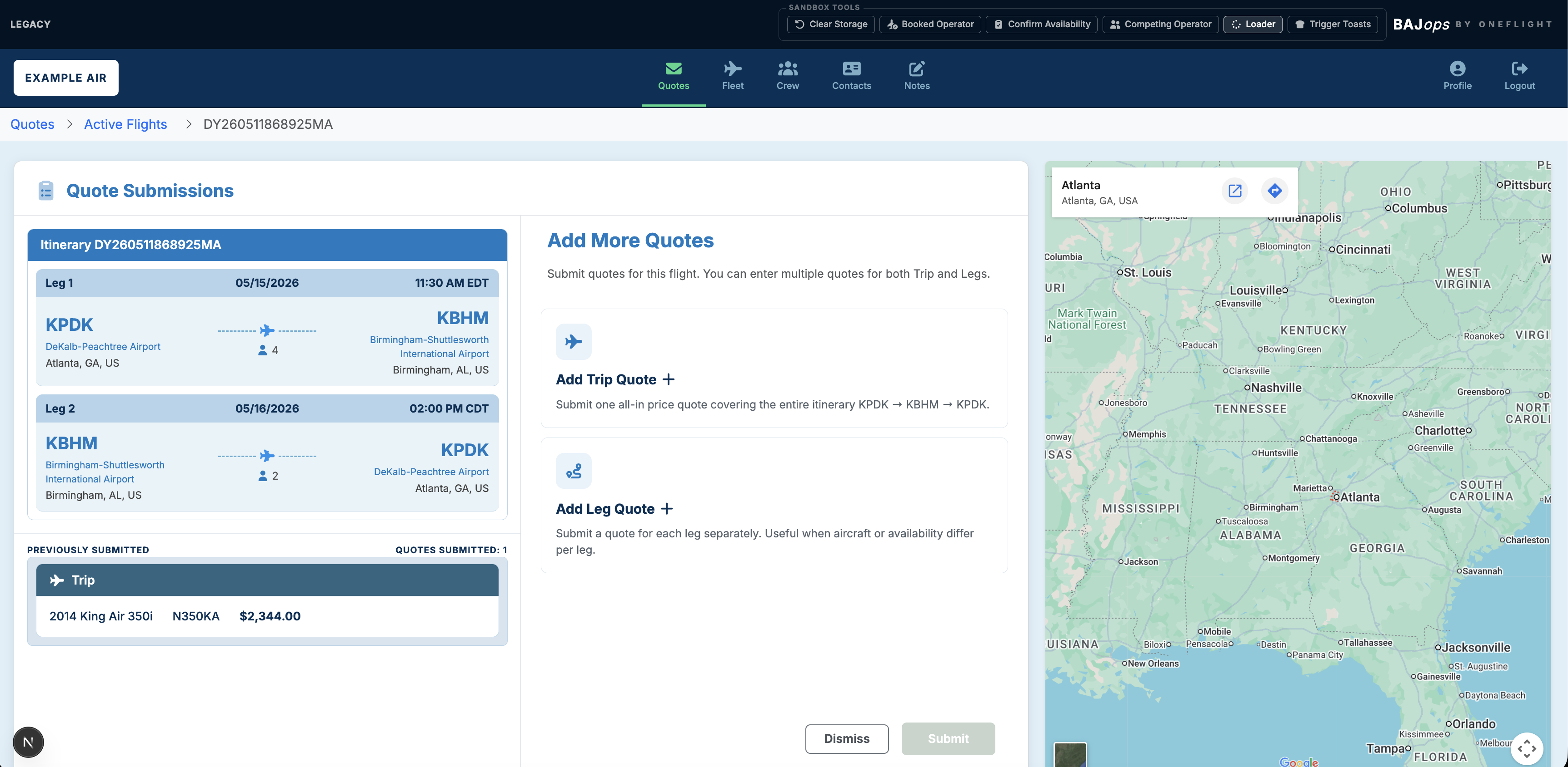
Every option an operator wanted to put in front of a coordinator had to be entered and uploaded on its own. There was no way to submit a set of quotes together, and nothing carried over between them.
Selected work Case study 01
Redesigning how operators quote, compare, and manage aviation trips
Private aviation · Operator experience
The redesigned workflow
The problem
01Problem
Every option an operator wanted to put in front of a coordinator had to be entered and uploaded on its own. There was no way to submit a set of quotes together, and nothing carried over between them.
02Why it mattered
A trip with several viable aircraft turned into a long sequence of near-identical submissions, retyping the same trip details each time. Operators sent fewer options than they actually had, so coordinators compared an incomplete picture.
03Solution
Multiple quotes in a single pass, held together at the trip and leg level, with existing information reused instead of retyped and competing options visible side by side.
Case overview
The request was to let operators add more than one quote. Feedback showed that another input alone would not meaningfully improve the work. Coordinators needed a clearer way to manage options across trips and legs, reuse existing information, and compare competing quotes as availability changed.
BAJops was the operator side of ONEflight’s booking service. This case focuses on the quoting workflow that shipped, followed by the planned consumer marketplace that would connect travelers to the other side of that work.
The interface captures use placeholder itinerary, pricing, aircraft, and operator information. Production customer and partner data is omitted.
Decision
Narrow option
This would satisfy the literal request quickly, but leave operators without a way to organize quotes, handle leg-level differences, or evaluate live alternatives.
Chosen direction
I made the case for a connected system that supported adding, finding, comparing, and acting on quotes. I bounded the first release around that complete operator decision rather than expanding into unrelated portal improvements.
Visible product decisions
These screens connect the product decisions to the interface. Operators can see the itinerary they are servicing, choose the right quote level, complete the information in context, and return to active work without rebuilding their mental model.
Public-safe captures use placeholder itinerary and pricing data. Production customer, partner, and operator information is omitted.
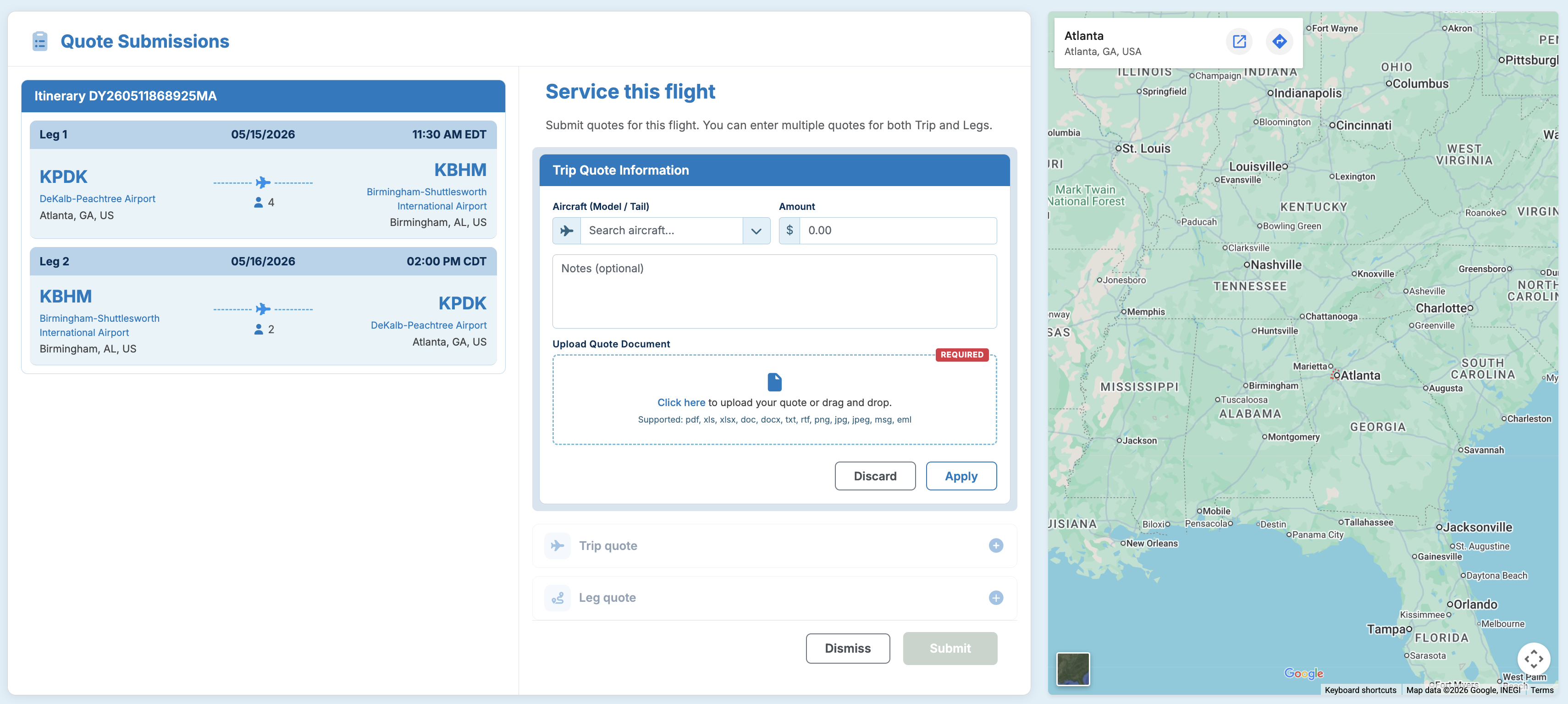
Trip context remains visible while aircraft, pricing, notes, and documentation are entered.
Trip and leg-level paths stay available within the same quoting workflow.
The route map reinforces the itinerary without competing with the primary task.
Manage and compare
The active flights view brings pending work into a scannable queue and gives competing quotes a clear home. That connection turns multiple quote entry from a small feature into a workflow operators can actually manage.
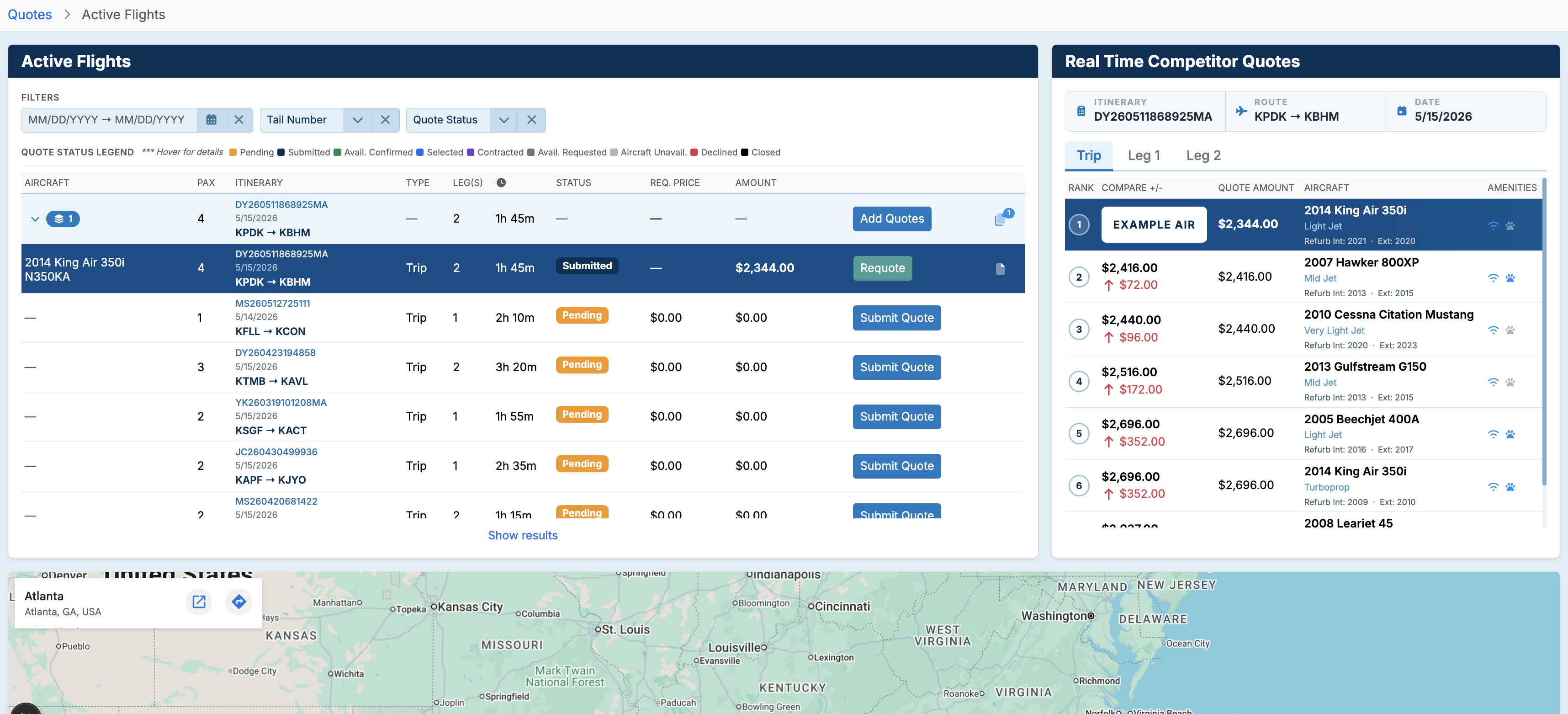
Filters, statuses, and actions make pending work easier to scan and prioritize.
Trip and leg tabs preserve comparison context at the level where the quote applies.
Rank and price differences make the competitive position visible without manual comparison.
Mobile direction
The mobile prototype reorganized desktop tables into itinerary cards. Status, competitive rank, and quote count stayed visible, with quoting and attachments grouped around the selected trip.
Explore the mobile prototypeAI-assisted product development
AI is part of my daily workflow. I choose the tool for the task, keep product judgment in the loop, and use working behavior to find difficult questions sooner.
I grouped feedback-form responses and recurring pain points around the decisions operators were trying to make, not the controls they requested.
I used Figma to establish hierarchy, states, and the relationship between trips, legs, saved quotes, and live comparisons.
I connected Claude to the Figma context, then used Claude, ChatGPT, and Cursor to turn the direction into realistic coded interactions.
The working prototype exposed questions around editing, reuse, changing options, empty states, and system feedback before engineering committed to an approach.
I componentized the sandbox so developers could use the code as a starting point and make small production adjustments instead of recreating the experience.
Outcome and evidence
Delivered result
The redesigned platform shipped to support quoting work for flight coordinators and third-party operators.
Customer signal
Before the redesign, recurring operator feedback was broadly negative. Feedback gathered after launch was consistently good to great. I am keeping this qualitative until I can verify the response volume.
Team leverage
The componentized sandbox gave engineers a working implementation foundation and reduced the ambiguity of translating static design files.
Measurement plan
These are success measures, not claims of completed impact. They keep future decisions grounded in operator behavior.
Consumer side · Planned and prototyped
Companion work to BAJops. These prototypes were not launched.
The marketplace was the consumer side of the service BAJops supported. Operators managed aircraft and quotes in the portal; the planned booking experience would help travelers explore their options.
I built two directions: the requested marketplace within the existing booking design, and an expanded concept with a redesigned visual hierarchy and interaction model.
Reflection
Moving directly into a second quote input would have been fast to start and expensive to revisit. Raw operator feedback gave me the conviction to solve a complete decision instead, while a coded prototype kept the boundary concrete.
If I repeated the work, I would establish baseline task timing and error tracking earlier. The feedback form improved the quality of our customer signal, but earlier behavioral measures would make the comparison stronger.
Want the details behind the redactions?